Is it bye-bye, Tiffany blue, hello ... Tiffany yellow?
It might seem hard to believe, but after more than 175 years, the luxury jewelry store is making some big changes to strive for a younger, hipper demographic.
Something's been brewing for a few months now, clearly. "Introducing our new House color," the company wrote on its Instagram page on April 1. "#TiffanyYellow."
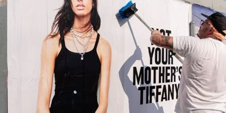
While that news started out as an April Fool's joke, it later became a pop-up sensation by late May and showed that there were at least some changes on the horizon. Since then, new ads for the company have been plastered on city walls, reading, "Not Your Mother's Tiffany." And captions on the company's Instagram account suggest, "Maybe it was cool back in the day? Maybe your mom is cooler than you."
The bold words in black type appear against a stark white background and are being paired with pictures of casually dressed models in jeans, blouses or camisoles, and piles of jewelry in a more modern, maximalist fashion. For instance, this Instagram post is captioned, "Your mom called. She said, 'I told you so.'"
So is this not your mom's Tiffany, and therefore is hip? Or that your mom was right all along ... which means she is hip? We're not sure what to make of all of this.
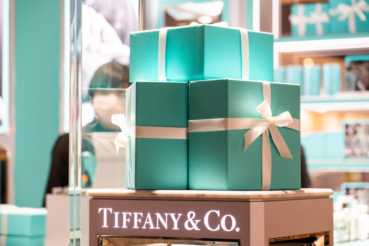
In any case, what's causing a stir is the absence of the famous robin's egg-blue color from those ads. Tiffany blue is a color so iconic it has its own Pantone designation, "1837 Blue," named after the year of Tiffany's founding. TODAY has reached out to Tiffany for comment, but is waiting on confirmation on whether the color is here to stay or will be seen as a symbol of the past.

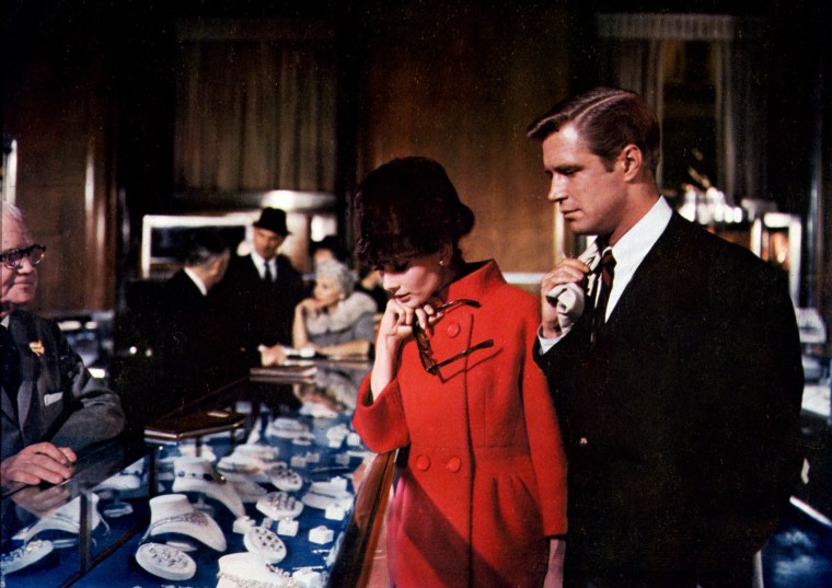
According to Pantone's website, the specific shade Tiffany blue was chosen by founder Charles Lewis Tiffany. It was the color on Tiffany's annual jewelry collection, known as a Blue Book. The company became iconic thanks to its consistent emphasis on luxury and quality (its 5th Avenue headquarters in New York City is almost like visiting a museum) and Hollywood films like 1961's "Breakfast at Tiffany's"), and in 2001 Pantone gave the color its unique number and name.
But the company's new owner, LVMH, which bought Tiffany's in early 2021, appears to want to steer the brand in a new direction.
"Color is a language, and as a language is one of the best ways to loudly, yet silently communicate that Tiffany is now under this new management, one who has quite different ideas of what the Tiffany brand can mean," Laurie Pressman, vice president of the Pantone Color Institute, shared with TODAY.
She notes that the potential yellow switch is a "good choice for Tiffany to 'shake things up,'" in part because it is bright and sunny, but that it connects with Generation Z. "There is no greater calling card for Tiffany under LVMH to send a subliminal message that they are also the brand of younger generations."
Not everyone is so cheerful about the changes, specifically about the message. Jewelry trade publication JCK Magazine notes that the slogan "Not Your Mother's Tiffany's" harkens back to a similar phrase used to make Oldsmobiles sound hip and trendy ... which "was a notorious flop."

Pressman said that including other colors doesn't mean blue is going away entirely. "This is integral to their brand heritage, but (they're) looking for ways to shake things up and make some very unexpected noise. But we will need to wait and see," she said.
For now, it's hard to say if abandoning a known image for a trendier one, while still trying to nod to older "mother" customers, will work. The fact remains that millennials and Gen Z customers aren't as interested in luxury items of the past, are getting married later and may have ethical issues with jewels like diamonds.
Ah, well: At least we'll always have Audrey Hepburn, fangirling outside Tiffany's with a cruller and coffee.
CORRECTION (Aug. 3, 2021, 2:00 p.m.): An earlier version of this article misstated the name of the Pantone Color Institute's vice president. She is Laurie Pressman, not Laura Pressman.
Related:
