An iconic brand of bouncy and gelatinous Americana is getting a modern makeover.
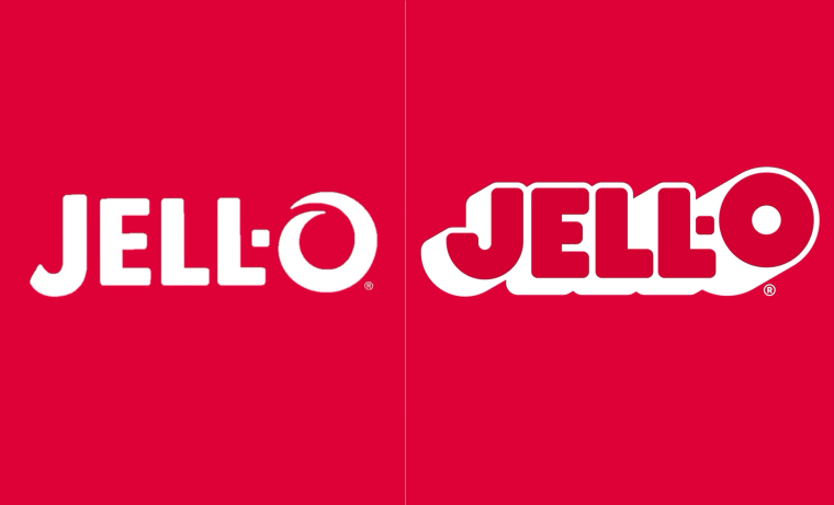
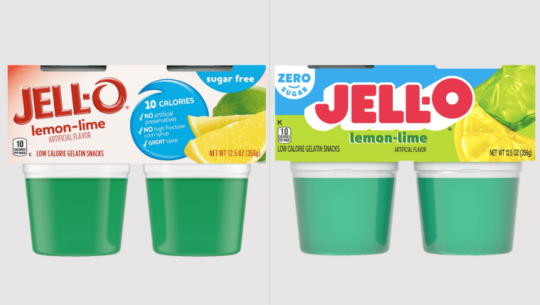
On July 27, Jell-O, the 126-year-old gelatin and pudding dessert brand, unveiled a new logo for the first time in 10 years. The new look, which also includes updated packaging, continues a long and storied tradition for the wobbly foodstuff of refreshing its look with the times.

“Originally developed in 1845, Jell-O has become synonymous with fun, creativity, and deliciousness,” reads a news release by the company. “With a rich heritage, Jell-O continues to delight generations with its fun and jiggly treats and remains a staple in households across America for either a dessert or a quick snack.”
Jell-O and its parent company Kraft Heinz say that launching a new visual identity aims to capture the “jiggly fun” that Jell-O brings to folks young and old, nodding to its past while looking towards a “vibrant future.” And hey, for a over century-old dessert to have such a hold on the culture that it’s part of one of the most famous movie scenes of all time, it must know what it’s doing.
“As ‘America’s Most Famous Dessert’, we aim to transcend generations and want to continue bringing our customers on a never-ending flavor journey,” said Kristina Hannant, associate director of desserts at Kraft Heinz in a press release. “After 10 years, it was time to take a look at our packaging and bring Jell-O into the future in a bold, playful, wonder-filled way.”

Jell-O’s new logo, according to the company, is “loud, proud and simple,” adding a bold and graphic drop shadow to its packaging for the first time. The brand says the design still holds onto what makes it recognizable to customers worldwide and intentionally put more emphasis on the “O,” turning it from a wave-like swirl into a bold and playful circle.
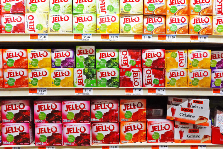
The logo has gone through many, many changes over the years, and its packaging has been revamped at least 10 times, from its original Victorian design scheme to simpler, fruitier or more complex and party-like designs. Through it all, though, the Jell-O logo has stayed a bold red color, and that commitment to cherry is here to stay, for now.
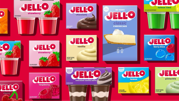
In addition, the new fruit and pudding imagery shifts away from literal depictions of the product to “re-imagining how the flavors can come to life in a playful, sensorial way, transporting customers into the Jell-O world of jiggly goodness,” and also spotlight the fact that select Jell-O products have zero sugar when applicable.

Basically, if you look closely at the gelatin packages, they’re fun and cute illustrations of what you could feasibly make with the product if you had the right Jell-O mold, and not just images of fruit or Jell-O as the company has included in the past. The pudding packages also feature perfect-looking dollops of each flavor on a simple background, eschewing the busy look of the previous design.
The updated Jell-O packaging will be rolled out across the entire Jell-O portfolio which includes pudding, gelatin, cups and other boxes starting this July, so there might be a few of the new boxes already trickling into your local grocer.
This rebrand is certainly not the only one of Kraft Heinz’s 18 brands that have changed its look and feel with the times. In 2022, Kraft Foods shortened the name of Kraft Macaroni and Cheese to Kraft Mac & Cheese, additionally revamping the product’s logo, packaging and even its noodle smile on the front of every box.
In other cheesy parts of the Kraft Heinz landscape, in May, Kraft Singles announced the launch of new, easier-to-open packaging, a fresher look and redesigned logo, to boot.

