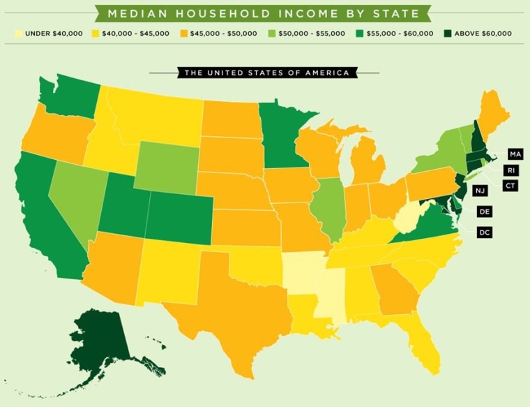
Our series of stories on people living on the national household median income of about $50,000 has generated thousands of comments from users, many of whom point out that $50,000 in Kansas is a lot different than $50,000 in New York.
An infographic produced by Mint.com makes that precise point, graphically.
Using Census Bureau data similar to what we are using for our own series, the Mint.com map shows that the states in the center of the country are closest to the national average, with median incomes that generally range from $40,000 to $55,000.
States in the Northeast tend to have a much higher household median above $60,000, while those in the Southeast have the lowest.
Mississippi ranks lowest with a household median income of about $36,600, while Maryland ranks highest at more than $69,000.
Via Business Insider.
Click here to see previous stories in our "We are the median" series. We’re also sharing our thoughts — and yours — on Twitter (hashtag #median), Facebook and Google Plus. We invite you to comment on our posts — but keep it civil and on topic, please!
Finally, please share your story of what it’s like to be living on about $50,000 a year by clicking here to send e-mail. We’ll feature some of your stories in future Life Inc. posts.
